Triple Attack Ace Count Effectiveness
To graphically demonstrate the large +EV advantage obtained by a simple Ace count in Triple Attack Blackjack, I compared the EV frequencies at the 1/2 shoe depth to normal blackjack using the hi-lo count. The graph below shows the Triple Attack edge dominates that of normal blackjack. The edges obtained in Triple Attack are both larger, and more frequent than in standard blackjack. The Ace count in Triple Attack is much simpler to track, compared to the hi-lo count, because you only have to identify one card — the Aces. The graph clearly shows that if you’re going to count at a shoe game, you should play Triple Attack. (Compare the areas under the curves, to the right of EV=0.)
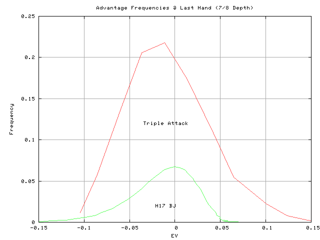
And for the last hand in the shoe:


How can both the green graphs and the red graphs above be right in the comparison at different penetration levels? the sum of all the frequencies on each line must equal one. The red graph has frequencies 2.5 to 5 or more times higher at every EV. I don’t see how the can each add to a total frequency of 1. If memory serves the same area under the graph should indicate the same frequency total. Each sum of the frequencies must be 1 for both the red and green graphs by definition. So the areas under the red and green graphs above must be equal. Eyeballing says the red graph has a frequency total 4 or 5 times that of the green graph.
I just checked the Triple Attack EV distribution (red). The sum of the frequencies adds up to 100%. This is also the case for BJ H17 curve (green) curve. However, there are quite a few more points to the green curve than the red curve along the EV axis. If I used a bar graph, you’d see wider red boxes, and narrower green boxes. You can’t directly integrate the area under these curves, because I mapped Count frequency through EV(count) to get the curves in the diagrams.
Good observation! It looks weird, but it’s right. You can’t directly integrate the area under the curve, because of the mapping through the EV vs. Count function.
Could you please make an apples to apples comparison by showing the 2 in bar graph form with the same EV range for each bar in the two graphs. The way you presented the information is not very useful and quite misleading. Your explanation does make sense but if the wider bars were on the regular blackjack graph the results might look just the opposite. Thanks a lot for the work.